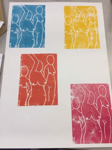
Using printing tiles was very enjoyable for me as I have used this material in the past before. Designing them is slightly difficult as any dints or marks on the tiles will show up when they have been printed. So I did a sketch on paper first to get the correct sketch I wanted to use to print. I used my life drawing work to do these prints as working from my past work gives me further ideas. After getting a basic outline of my design I then carved it into the tiles with a biro pen as this left a dark and deep outline of the drawing and it was very clear for me to see where not to roll the paint. When the design was completed I then chose four different colours as shown below and did the first base of prints, I placed them around the A1 paper to give all the prints enough room when I will begin to overlap them.
Then when the bases had dried I began to overlap the colours and carve certain sections out of the tile. Then I printed the parts I cut out in a variety of colours. This made the prints very colourful and different to each one in some way, I like that I did this as it created a style of an artist I know however I didn't intend on doing so. Henri Matisse did a lot of human figure paintings but designed them to be very abstract and strange. For example "The Dance" is one of his most famous paintings and they include small figures circling around a grassed area. After discovering this artist I intend on looking further into his work.

These are photos of the prints up close. As you can see mainly in the backgrounds of the prints I haven't put enough paint on as with patches are showing, I feel that is a main improvement I can progress on as it is important that you get a solid colour when printing so it becomes clearer to the audience. With the colours choice I didn't find as hard, this is because I have the three primary colour blue, yellow and red. So to create other shades of colours I mixed them and created pinks, greens, oranges and even lighter shades such as baby blue. I also had with me white and black I didn't use these too much to mix with or print with as they are slightly predictable and simple. Below the first two images are edits of my work. I did them on photoshop to add more of a brighter vibe to it and experiment with another media. I feel they went quite well as changing the levels, curves and brightness of the images really did effect the overall look of my work. Continuing tile printing isa defiant yes as I feel confident when doing it, however maybe using a different material to print on could be an idea for the future.


Comments
Post a Comment