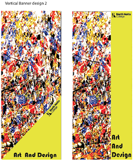
Now for my a second banner design I had taken a photo of a very small area of the wall and zoomed in even further to focus on the more complicated area of the image. The reason why I did this was so that I got a chaotic look to the image and I wanted to get as much paint in as possible in the image for my idea. Firstly I placed the image into photoshop and experimented with levels and curves. I knew that id need to edit the curves of the image as I knew I wanted it to be striking and eye-catching, also to make the photo much brighter and vivid I enhanced the reds and yellows and altered the saturation and contrast. By doing this it has given me the image below that I am now ready to work with and use to create my second banner design.
I chose images from google to help me out and create a structure to my banner. Then made two rectangles sized 120mm x 300mm and added my edited photo to the rectangle for the background of the design. Adding to my design, I used a variety of shapes and fitted them around the design to see how it would turn out, I also altered the colours and the opacity of the blocks to have the background showing through slightly.
Here are the same designs but with a few changes. I tested out using a very bright bold colour for the blocks and this did not work as the background was already busy enough. Then after looking at different opacities I came to the conclusion to stick with a solid dark colour e.g black.

Consequently for the solid dark colour I decided to use black as this takes away the distraction from the background as I want this to be the main area of the banner to look at. Although, as I made this fully black I need to edit the colour of the college logo as the grey blended in slightly with the black, so I made the whole logo white and in my opinion it worked well. Furthermore I used Bauhaus for the text this explains why I researched into it as this helped me to understand where and how they use the text type. I enjoyed creating this particular banner as I found the image I was working with very lively and fun so to extend this design I am going to create a poster just like it but with a little bit of a change, same with the business cards, I will experiment using illustrator.


Comments
Post a Comment