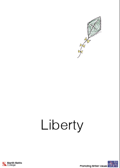
For my sixth idea I developed the poster from my fifth idea. I stuck with the simple white background and one single object as I did with the fifth poster because I knew that it was working well and was creating a very powerful meaning to the poster. Having one image focuses on the point I am making and emphasises on how liberty is shown in different ways. Using the kite symbolises freedom and defines the meaning of being free and being able to have the option to do what you want. I got the idea of using a kite from my research into minimal poster design, I came across the red poster in the screenshot below that gave me the idea to use a feather, then I thought about what British value it links with most, eventually I chose Liberty. The meaning of liberty is having your own rights and freedom to go and do as you please, this is why I used a kite as it links with both meanings. I used Helvetica light as this created a simple yet still effective look to it.


Comments
Post a Comment