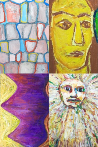
I began by researching into recent artists I've discovered for a fresh new idea and I decided to look into a very unpopular Japanese artist named Kazuya Akimoto. I really enjoy his work as it is very attractive and different to others, this is why I am using his techniques to create my own painting in the style of his work for the survival guide.
This is some of his work:

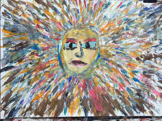
I mainly focused on the bottom right painting, however used colours and techniques from his other paintings as well, e.g the way he paints lips, how he paints colours over colours and the choice of colours he uses. Im happy with the colours I've chosen and the eyes on the face as I feel the colours are appropriate and the eyes are an abstract shape.

This is some of his work:

I mainly focused on the bottom right painting, however used colours and techniques from his other paintings as well, e.g the way he paints lips, how he paints colours over colours and the choice of colours he uses. Im happy with the colours I've chosen and the eyes on the face as I feel the colours are appropriate and the eyes are an abstract shape.

After I had finished creating this piece of work, I uploaded it into photoshop and went into image, adjustments and curves. I then experimented with different tones and colours and enhanced certain areas to create a very bold effect for the photo. However I feel that I should of focused on the tones on the face but I am very happy with the background as it is attractive and bright.
Looking back on what I could improve; I decided to screenshot main areas of the painting and merge then together to create a messy abstract look for the front cover. Then deciding on the text was a hard choice as I knew that I needed a bold but in some way simple text, so I chose "impact". Then I created a white circle with no outline and placed it in the centre this was a section for the text to go in. Consequently I used a black back cover because the front cover is already very busy so I didn't go into detail on the back so I didn't complicate the look of it.
This is my final finished design. After observing my work even further I realised that using the circle around the writing was a bad idea, this is because it simplified it and created a rather boring look to it in my opinion. So, after editing the circle out I enlarged the writing and outlined it in white and added the years to the guide that it is to be used for. As well as editing the front cover I also changed the back cover slightly, I did this by loading the edited photo of my painting up and screen shotted sections from it again. I then overlapped them and placed them just above the logo. After experimenting with different designs for this guide I've finally finished this one and I am very happy with it as it appeals to the younger generation and is very bright and bold so it will be noticed.


Comments
Post a Comment